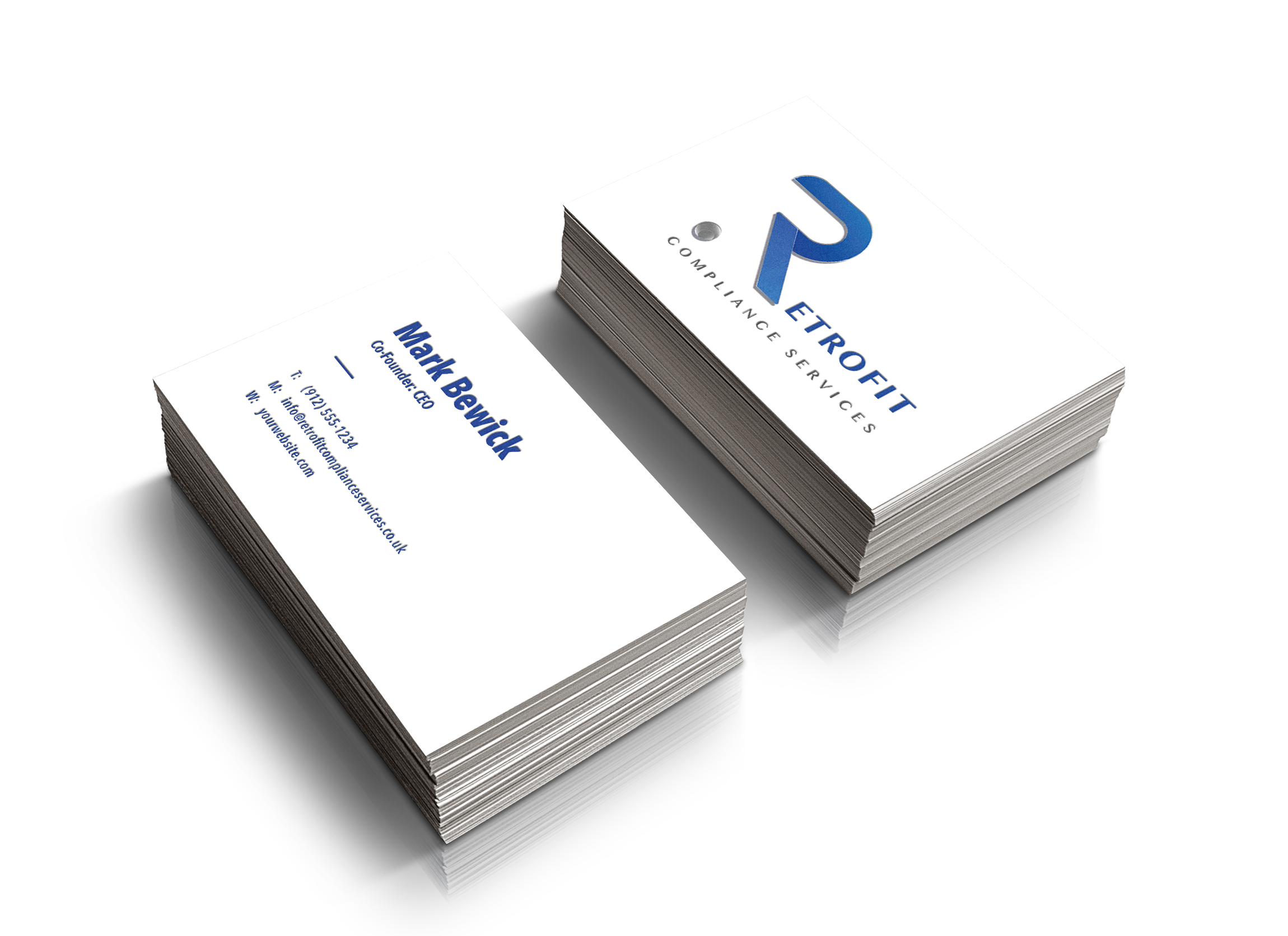
It’s always with a sense of pride we launch a new brand, even more so when you also get to design a stylish website.
Retrofit Compliance Services are a brand new company that needed a professional brand to get their journey kick-started. The client’s instructions were very clear, keep it clean and keep it simple.
Retrofit Compliance Services is a professional company dedicated to all aspects of survey, design, coordination and advice in the Eco and Retrofit industries. They aim to provide a friendly, helpful and hassle-free service to facilitate companies who want to navigate the increasingly complicated world of compliance. So we needed to design a brand that was a reflection of this message.
We opted for blues and greys as blue is often seen as a sign of stability and reliability and uncompromising excellence and grey represents neutrality and balance and trust.
We looked at other brands that incorporated these colours as well as utilising a letter as part of the logo to create a useful icon/submark.

Final Logo


Website
The next stage was to look at their website. They gave the same instruction as they did for their brand, clean and simple! The purpose of the website is purely informational and so that people would be able to get an overall feeling of who they are, with the hopes of customers contacting them for quotes.
We think that we really delivered on what they wanted.
ITC Digital did exactly what we asked for, a professional-looking brand and also a website that looks fantastic!
Mark Bewick
To view the full website visit: retrofitcomplianceservices.co.uk
